Supporting a science center that seeks answers to key existential questions. How did we get here?
A team of scientists asked us to create an iconic identity in support of a Dutch research platform into the origins and evolution of life. We did.
Welcome to a big hello
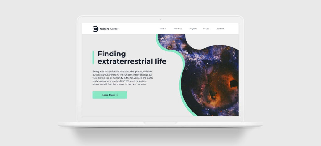
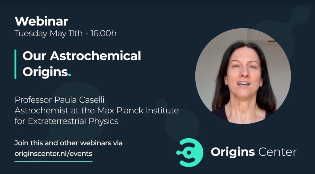
So, how do you create some attention during expos and science meetings around the world? Yup. A vibrant short video will work just fine. But first, we crMeated a coherent brand identity and a logo. From that, we designed a website, an accessible home for attending webinars, listening to exciting podcasts, or ordering the special issue of Origin, a bookazine for scientists and the public. Recognizable. Nautilus meets Star Trek.
Check out the video? Click the visual or click here.
One style, one message, one voice.
We always keep in mind that brands, their content, and their design suit a purpose. Sustainable brand identities stem from an integrated idea that suits or serves people and makes sense. Logos of inspiration have a context, they explain, empower, and reiterate values and bring a sense of belonging.
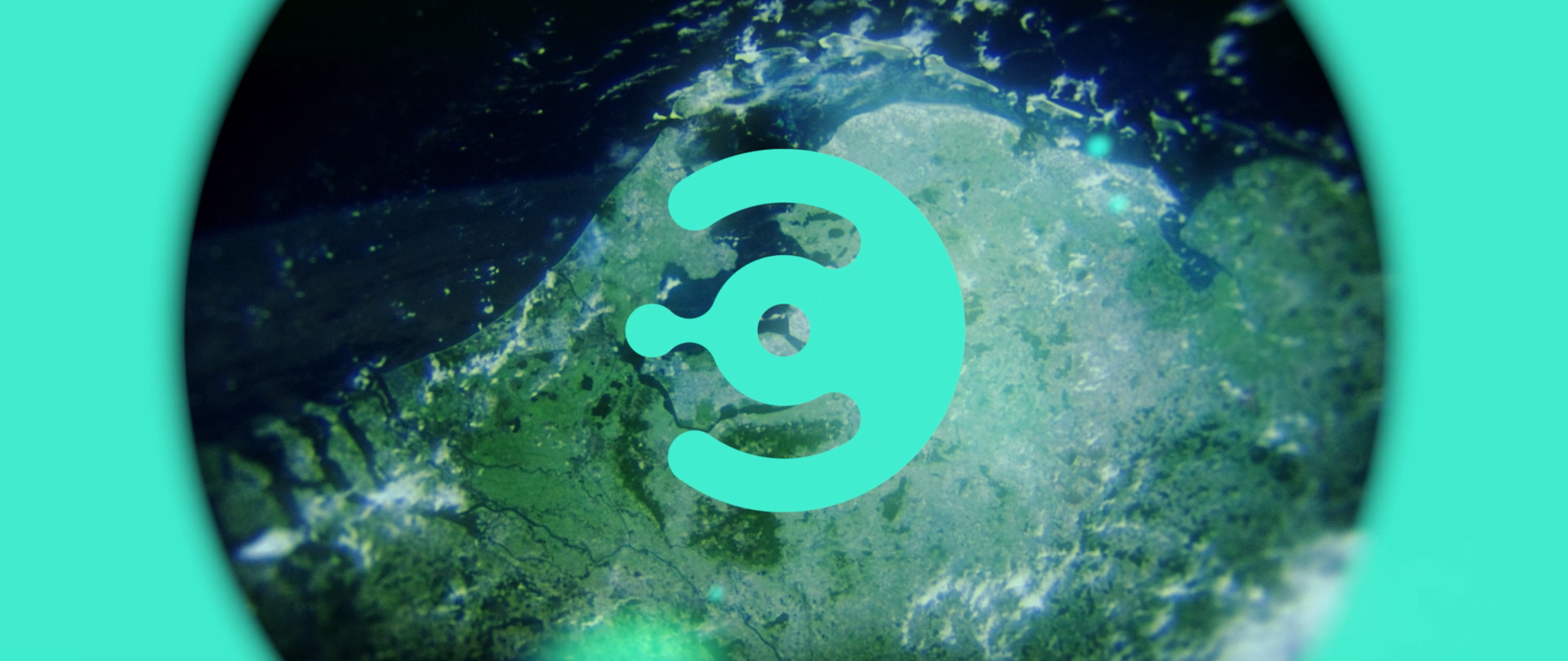
In the Origins Center identity, we designed a cut-out as a graphical element. It is an authentic perspective on Earth, visualizes cell division, and embodies the dynamics of life, and the formation of planets.
We were happy to use amazing images, sharing the fascination of scientists for our planet and beyond.
Client: Utrecht University / University of Groningen
Creative director: Arold Jansen (Dan Brinkhuis / video)
Art director / graphic designer: Wessel Kramer
DTP/graphic designer: Hans van Dijk
Video editor: Dick Peterse
Web developer: Govard-Jan de Jong en Aart-Jan van der Linden